Graphs
Plot any node value over time. Open the Graph tab; each graph is its own sub-tab (add several).
Adding series
- Click Edit series on the plot to open the series panel.
- Add key — pick any
instanceId.keynumeric or boolean node value (booleans plot as ±1). - Or right-click an attribute in the record detail view to add it straight to the current, a named, or a new graph.
The series key has a reserved strip to the right of the plot; it never covers data. Right-click a label to remove it. Long keys and lists scroll within that strip.
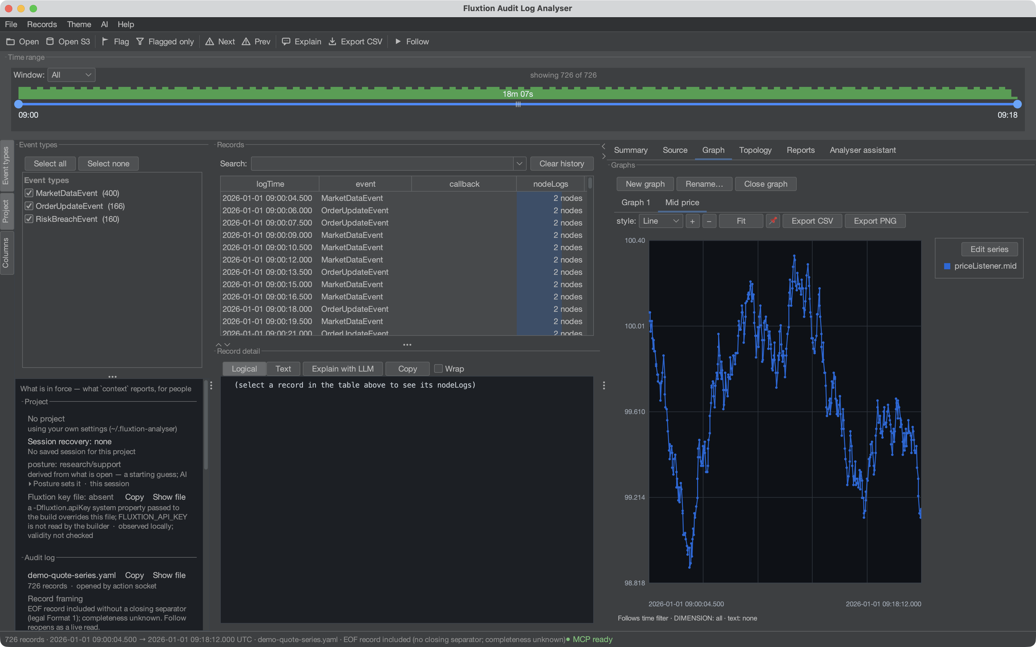
That is one node's mid across a few hundred cycles. Nothing was extracted or transformed to get it:
the value was in the audit log because the node logged it, and every point on the line is a record you
can click back to.
Formula series — f(x)
Beyond raw keys, add a derived series from a formula over other keys, e.g.:
- The f(x) field shows a dropdown of matching keys and formula labels as you type — ↓/↑ to move, Enter or Tab to accept, Esc to dismiss.
- Formulas can reference other formulas by their label.
- Resolve policy: locf carries each ref's last value (for cross-node formulas); strict only evaluates within a single record.
- Conditionals — a formula can judge its inputs: comparisons (
> < >= <= == !=) andif(condition, then)/if(condition, then, else), plusand/or/not. The two-argumentifplots only while the condition holds — a false condition yields no data point, so
draws the spread only where it is in breach, with gaps everywhere else. An unknowable condition
(a missing value) plots nothing rather than guessing a branch.
- Literals — node.ready == true and node.ready == false use the graph's existing
+1/-1 boolean representation. Compare flags explicitly: bare false is -1, not the numeric
zero used by conditional results. node.status == "rejected" or != "rejected" compares text
exactly, without converting booleans or numbers to strings. Missing/null values remain unknown.
A quoted-scalar reader preserves "true" as text; the legacy text reader keeps quote characters
literally. Strings support equality/inequality only; quoted durations still name rolling windows.
- Rolling windows — formulas can remember recent samples: lag(x, N) (the value N samples ago),
delta(x) (change since the previous sample), and mean / sum / rollingMin / rollingMax
(x, N) over the last N samples. A window fills before it speaks (no point until N samples), a
non-numeric sample leaves it unchanged — which also means a full count window holds its value
indefinitely after the last contributing sample: on a gated series like mean(if(c, x), 10) the
plotted mean can be arbitrarily old once c stops holding (the time-windowed forms go empty
instead; prefer them when staleness matters) — and it counts samples, not time — a quiet
market makes a count window span more wall-clock, so for anything rate-sensitive prefer the time-windowed
forms: mean / sum / rollingMin / rollingMax (x, "5m") (durations: "250ms", "5s",
"2m", "1h") and rate(x, "1m") — the change per minute, scaled from however much of the minute
the samples actually cover, so a filling window and a full one both read the true rate. A time window
needs no fill (one sample answers; a rate needs two, separated in time), and old samples age out
against each record's own clock.
The series query follows the same rule: filter.from / filter.to restrict returned points,
while rolling formulas use earlier history from the loaded log (with other filters still applied).
A change on the first in-window record is retained, and an already-active threshold does not become
a new crossing merely because the window starts there. Missing history before the log begins still
produces no point until the function's history requirement is met.
Zooming the time slider never changes a window's contents; only changing the dimension/text filter
re-extracts.
Conditionals and windows compose, and the order chooses the meaning:
| expression | meaning |
|---|---|
if(c, mean(x, 10)) |
mean over all samples, plotted only while c holds — gate the output |
mean(if(c, x), 10) |
mean over only the samples where c held — gate the input |
Thresholds and condition bands
A threshold worth investigating deserves to be visible, not interpolated by eye. A guide is a
labelled horizontal rule at a value (0.004 — 4bp limit), drawn against either scale, persisted with
the graph and exported with it.
A condition band shades the time intervals where a condition held —
askMakerOrder.price − bidMakerOrder.price > 0.004 as a region you can see at a glance, rather than
gaps you infer. The condition is what's saved; its intervals are recomputed with the data, by the
same extraction pass as the series, so a band can never disagree with a plotted series about when the
condition was true. Both are agent-authorable through the graph verb (guides:/bands:).
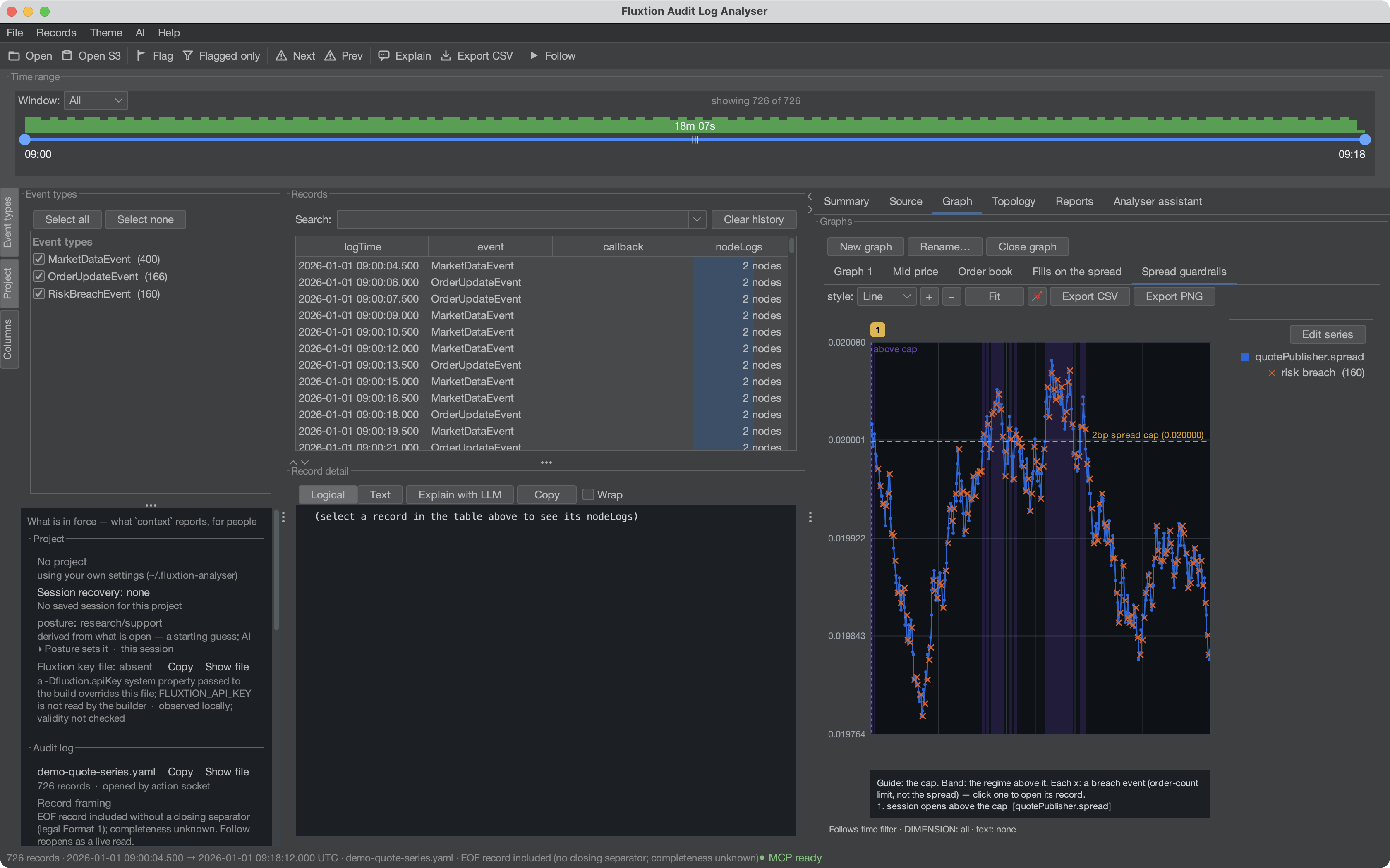
One chart, three annotation layers, each answering a different question: the guide marks the threshold, the band shades exactly where the line sits above it (a claim you can verify by eye), and each × is a discrete breach event — a different fact entirely, which is why the on-plot explanation says so instead of letting the composition imply it.
External series — plotting what the outside world did
The analyser never learns a foreign format: you (or an agent) adapt a FIX log, GC log or venue export
into a (timestamp, value) CSV, and File ▸ Add series from CSV… plots it beside the audit-derived
series. The dialog asks for the time/value columns, the time format and the IANA zone —
declared, never guessed, because a silently mis-read clock turns "the venue messaged us, then our book
moved" into its reverse. An optional offset applies a deliberate clock correction, always shown.
External series are visibly second-class, on purpose: marked (external) in the legend, stamped on the chart itself (so every PNG/PDF says a foreign line is foreign), not clickable to records, and saved as their definition — reopening reloads the file, and a missing file is reported while the rest of the graph draws.
Marker series — events on the chart
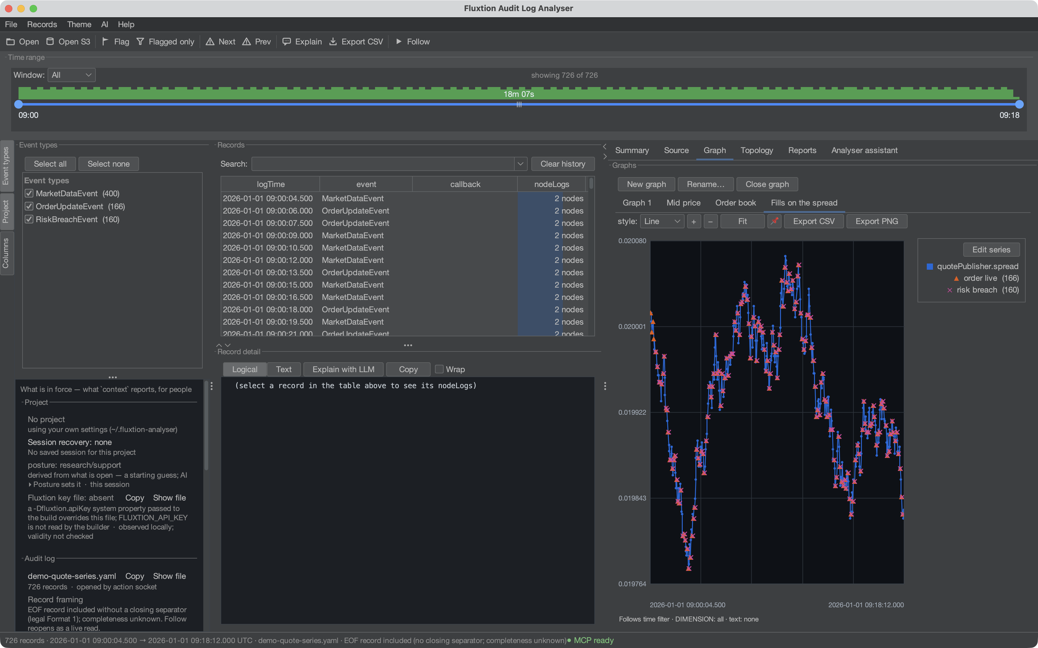
Values answer "what was it"; markers answer "what happened": fills, rejections, cancels drawn as
glyphs (▲ buys, ▼ sells) at their price, each carrying a payload — a client order id — shown on
hover. Clicking a marker selects its record: the marker is a signpost to the evidence, never a
substitute for it, payload display alone does not make the payload a formula input. A formula must name a logged key explicitly. A moment with many
markers renders one glyph with a ×N count badge rather than soup — the presence of hidden markers
is always visible. A marker's y can be a key, a formula, a plotted series to ride, or axis for a
tick lane under the plot; and hovering any series now snaps to the nearest actual sample
(series · time · value), with dense series answering their column's min/max range.
Each marker series gets its own legend row — its glyph, in its colour, with the number of events
it holds (▲ order live (166)). The count is how many events there are, not how many glyphs fitted
on screen: those collapse into ×N badges as you zoom out, and a key that changed its number while the
data stood still would be its own small lie. A series that matched nothing still gets a row,
reading (0) with the reason on hover — a y pinned to a series that isn't on this graph, or a
when that never fired. An event type that never occurred is a finding, not something to hide.
Right-click a row to remove that marker series.
Markers can also come from outside the log: the same CSV contract as external series
(markers: [{label, glyph, external: {path, time, timeFormat, zone, value, payload}}]) with a
payload column — agent-parsed FIX fills with an order id per row. The clock is declared, never
guessed; the chart is stamped exactly as for external series; and the points are not records
— no click-through, because an external row must never pretend to be audit evidence. Omit value
and the markers tick the axis lane.
Flagged records join every chart automatically as a built-in ⚑ flags rug on the axis lane —
each tick carries its finding note on hover and clicks through to its record, the legend row counts
them, and unflagging is how a tick is removed (the rug derives from the flags; it is never persisted
or shared).
when decides where a marker fires. A bare key (orderTracker.orderId) fires only on
records where that key was logged. New marker conditions default to resolve: "STRICT":
orderTracker.live > 0 tests values in that record, without borrowing a previous record's value.
Choose resolve: "LOCF" explicitly to evaluate carried state on each record instead. Those counts
are states, not event counts; the legend, tooltip and PDF notes say so. For a regime, consider a
condition band.
Older saved markers with no resolve keep LOCF; opening a project does not silently change
its evidence. Replace their marker definitions with resolve: "STRICT" to opt into same-record
conditions. The graph echo states each accepted marker's resolution. y expressions use the same
resolution, while y: "series:<label>" deliberately samples the plotted series at or before the
marker time in either mode. Bare-key occurrence and payload anchoring are unchanged.
Two scales
A revenue line reaching 2,000 and a stock level oscillating around 20 share a chart where the stock line is a flat smear along the axis. Both facts are on screen and neither is readable — which is worse than plotting them apart, because it looks like an answer.
Put the smaller series on the right-hand scale and both become legible against a shared grid:
Two scales, not three: past two, a reader has to consult a legend to know what a height means, and the chart has stopped being a picture.
Explaining a chart
A plot says what happened. It never says why that matters, and that second half is usually lost with the screenshot. Both are held with the graph and drawn on it, so they survive an exported PNG:
explanation— a multi-line write-up below the plot, with long lines wrapped.notes— pinned to moments, numbered on the chart and listed beneath it. Anchor one withat(epoch millis) orrecordIndex, whichever you have to hand.
{"explanation": "Revenue is priced from the request, not from what the shelf could supply.",
 "notes": [{"recordIndex": 99, "text": "first oversell — shelf at zero, till still ringing",
            "series": "stockLedger.onHand"}]}
Nearby or coincident note pins combine into numbered ranges above the plot; the full numbered text stays below. A long footer explicitly counts omitted lines and shows all text on hover. clearNotes drops the pins
while keeping the write-up. The threshold chart above wears both:
its explanation box states what each layer means, and note ① pins the session's opening moment.
Styling, zoom and pins
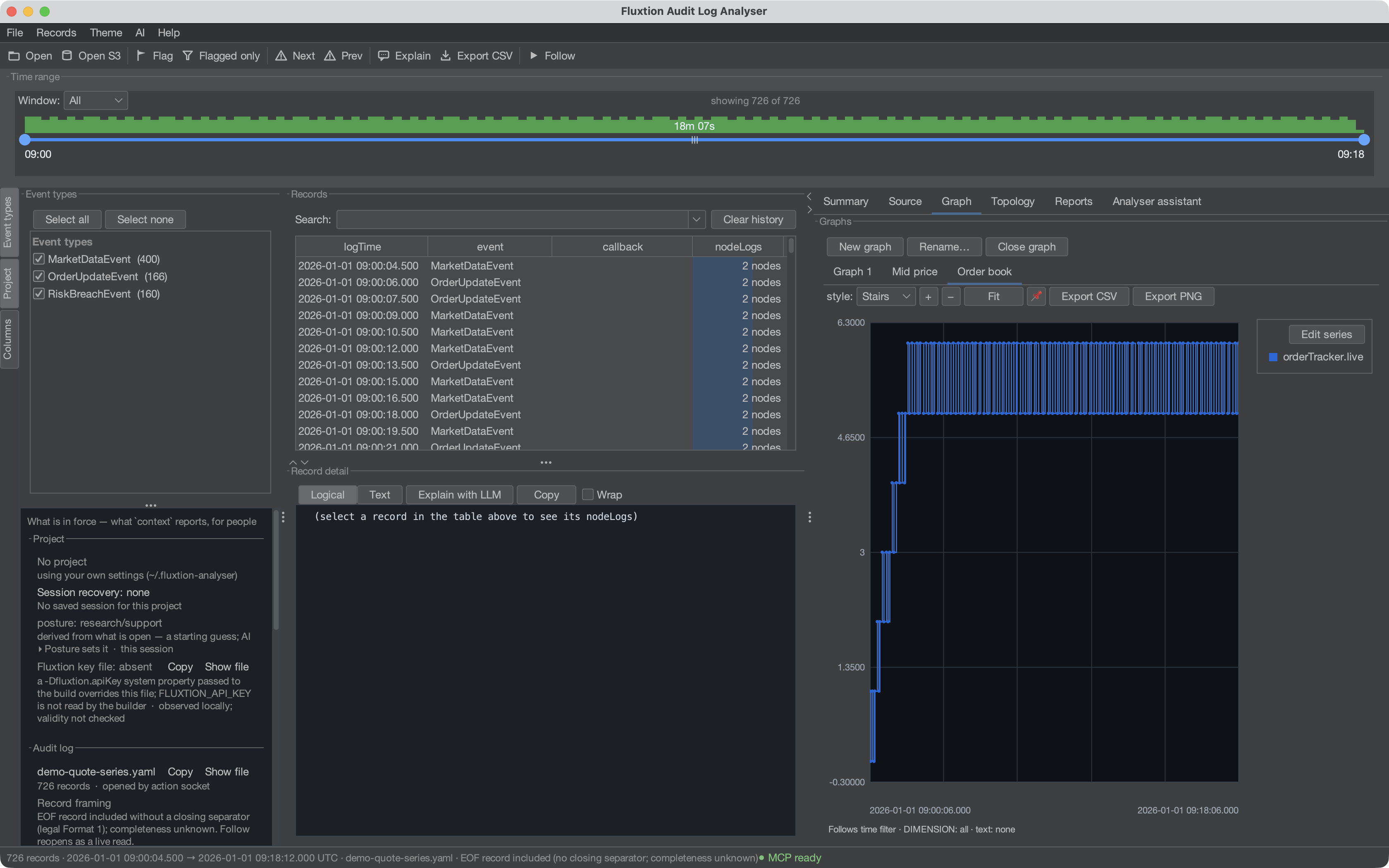
Stairs is the honest style for a value that holds between updates — an order count, a state, a
threshold. A line between two samples implies the value passed through everything in between, which for
orderTracker.live it never did.
- Style — stairs (step), line or points.
- Zoom / pan —
+/−/ Fit, or drag to pan. - Pin — 📌 fixes a graph to a time window so it stops following the shared filter.
- Live, under Follow — an open graph re-extracts as records arrive. The view moves only to reveal a point
that would otherwise be hidden: a chart that already shows it does not move; one showing the whole log grows
with it; one pressed to the live edge slides with it; one zoomed into the middle holds. A pinned graph keeps
its window and gains the data. Changing the graph's definition still resets the view. An agent can ask for
a re-extract with
graph {refresh: true}; a re-send that changes nothing re-extracts nothing.
Export
- Export CSV writes the plotted series; Export PNG saves the chart image.
Saved graphs (names, series, formulas and pins) persist in your profile and reopen with the next log — and can be shared, see Sharing setups.
A series can also be started from the graph of the processor itself — right-click a node in Topology & step-through and pick one of the values it logged.
Marker labels are not yet individual series spotlight targets. The assistant receives an explicit
refusal and can spotlight the graph plot instead. Exported PDFs spell the flag glyph as flag when
using the standard PDF fonts.
Windowing, pinning and saved-chart restore fit each vertical axis to its own series in the visible time range. A right-axis series never changes the left-axis scale; a side with no finite points uses a neutral 0–1 range. Guides and markers do not widen either scale.
When a saved chart is empty
The line below each chart states its pinned bounds (or that it follows the time filter),
the dimension grouping/selection, and the text filter. A saved pin is retained when the chart
is restored on another log. If its window is outside the extracted series, the plot says so;
an empty window is not evidence that the application produced no data. Clear the pin with the
pin button or graph {name: "…", from: null, to: null}; dimension and text filters remain in force.
context.graphScopes and the graph action’s scope echo expose the same bounds, filters,
extraction state, finite series sample counts and empty reason. Pending or failed extraction
does not report the previous sample counts as current. Counts are series samples, not records
or markers. Report chart captions carry the scope so it survives PDF export.